All information in this case study is based on my own experience and does not necessarily reflect Lan's point of view. I avoided to included confidential content and names. Also, I edited Lan's branding only for presentational purposes.
Overview
When I worked as a web designer in the design team at Lan.com (aka LATAM airlines), my role included making wireframes, improving user interactions, and implementing design mock-ups of different sections of Lan.com. One of the projects assigned to me was to redesign a part of the rental car booking process, precisely the search results page.
At that time, I learned too late to keep an updated work journal to help me write case studies. That is why I decided to work on a concept exploration by recreating an old project I worked on Lan.com and write this case study by considering part of the insights I found for the new proposal and using some experiences of the process of my previous work.
If I explain my journey with this project, it was my first time working on an online booking platform. As this topic was new to me, it was challenging at first, but I took it as a personal opportunity to learn & work on something that would add a positive experience to my career as a designer. To accomplish this, I remember reading about best UI practices from Nielsen's group and Smashing's Magazine articles to acquire more knowledge.
My process and the problem
My design process followed Discovery > Design > Development as steps. One of the first things I did as part of my discovery process was to meet internal stakeholders to have a concept or idea I wanted to explore, then discuss the problem, map any assumptions or biases, write down everything about the work to come, and look through past research or designs. Also, it was important to me to understand and learn about the big picture.
- What do and don't we know about the problem?
- What are the main users' pains while using the result page of the booking rental car process?
- Why do we need to make changes to this search results page?
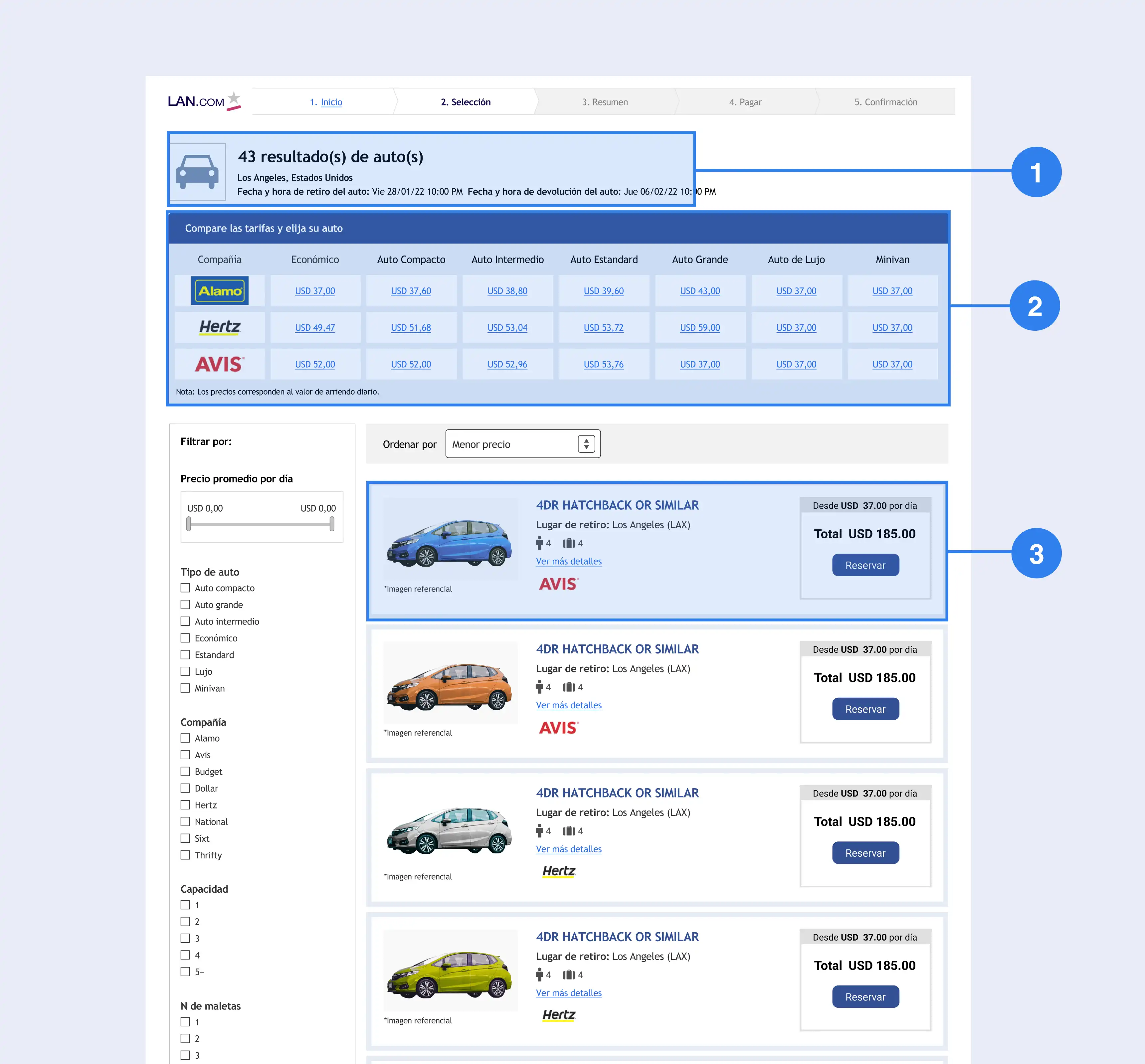
- How are the users solving the problem today?
- How are our competitors doing it?
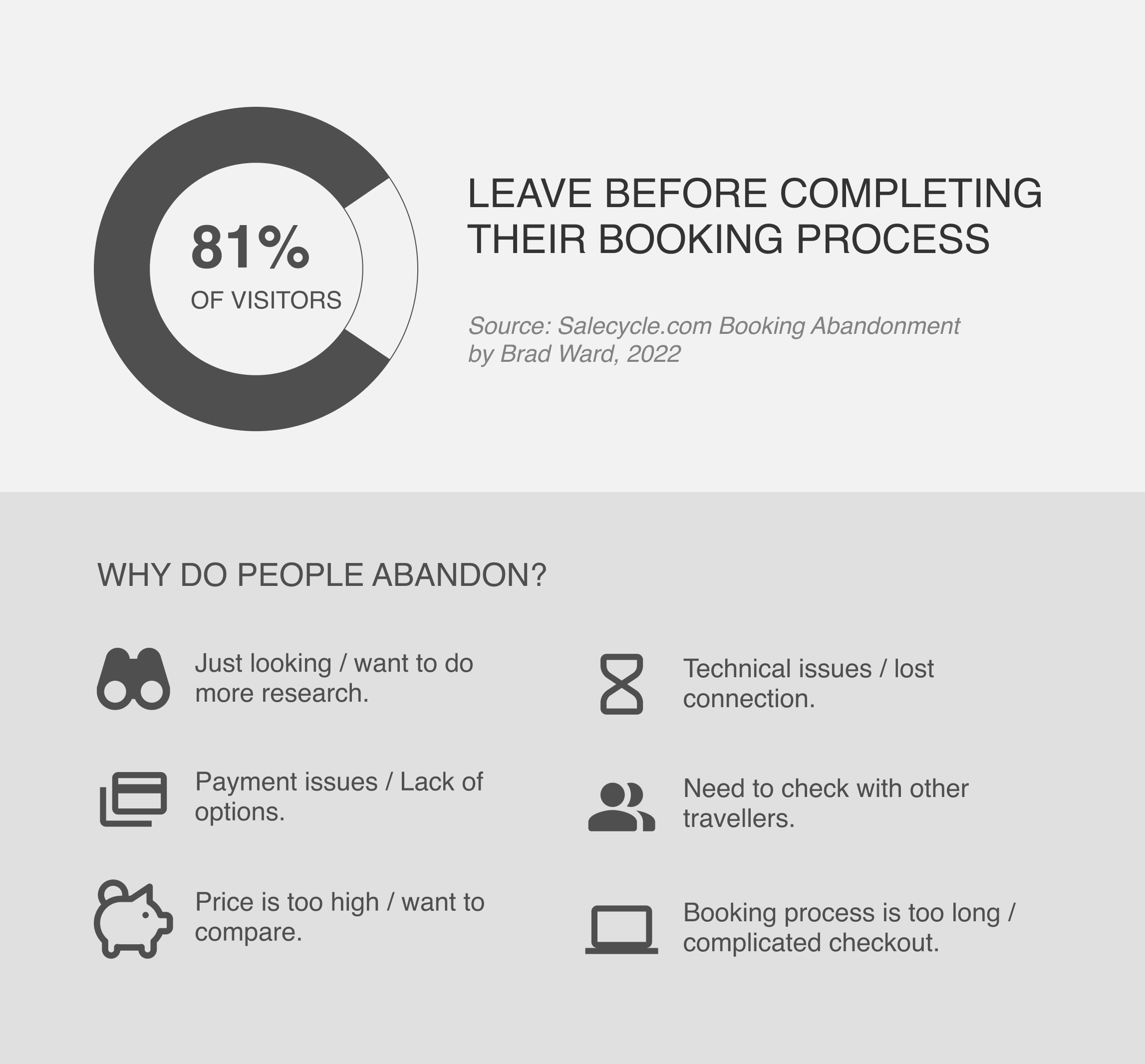
So, after gathering all the information, I refined and defined the problem hypothesis into a problem statement for users and the business problem to find a balance to accomplish both parties.
- For users:
- The purpose of this page is to help Lan's users to find the car they need for their upcoming travel. And the problem I'm trying to solve is to reduce frustrations while renting a car in the booking process on Lan.com.
- For business:
- The problem is that I'm trying to decrease user abandonment while users are trying to rent a car in the booking process on Lan.com.
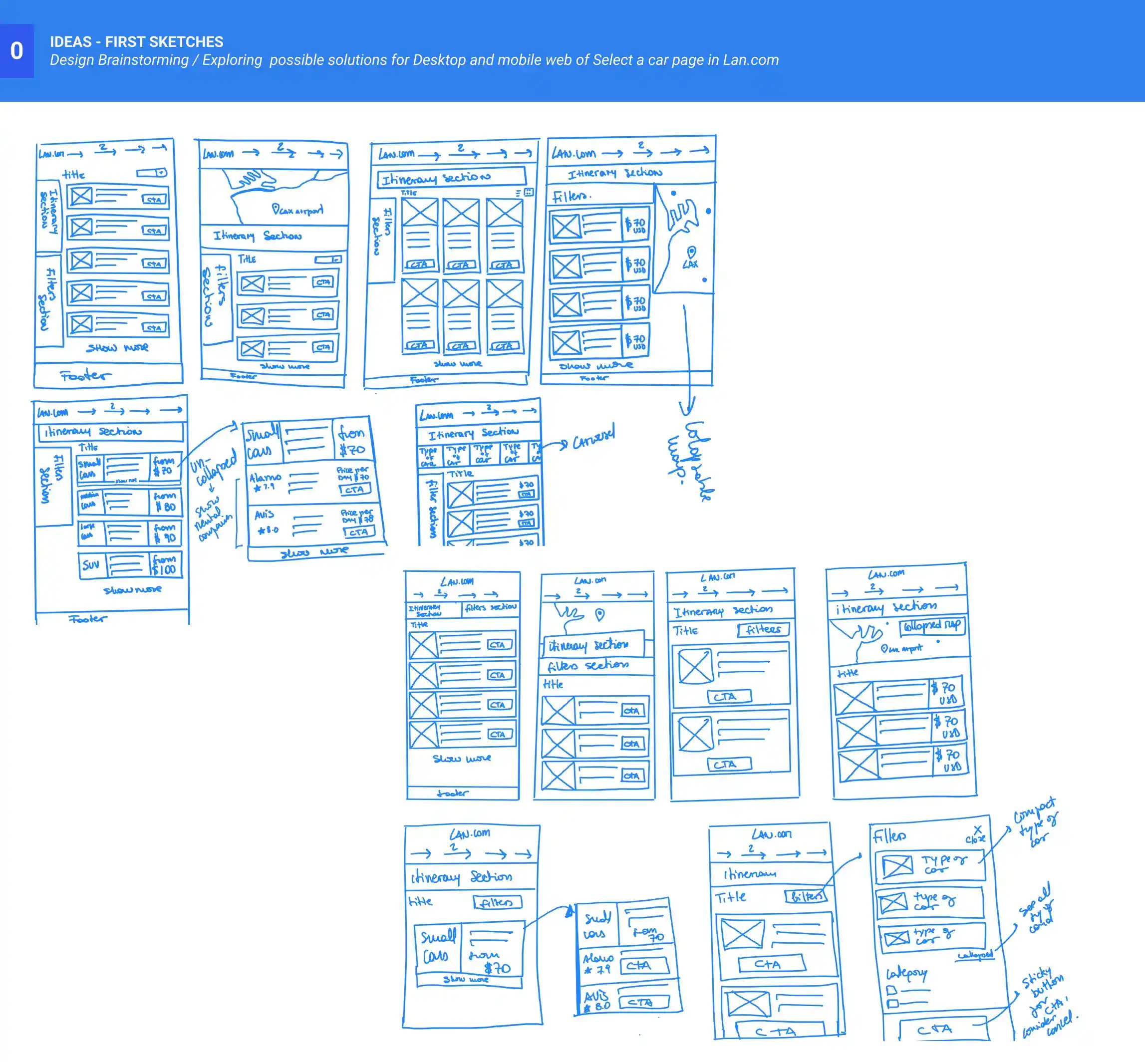
Then, I began sketching solutions as a brainstorming, choosing some ideas based on solving the problem defined.
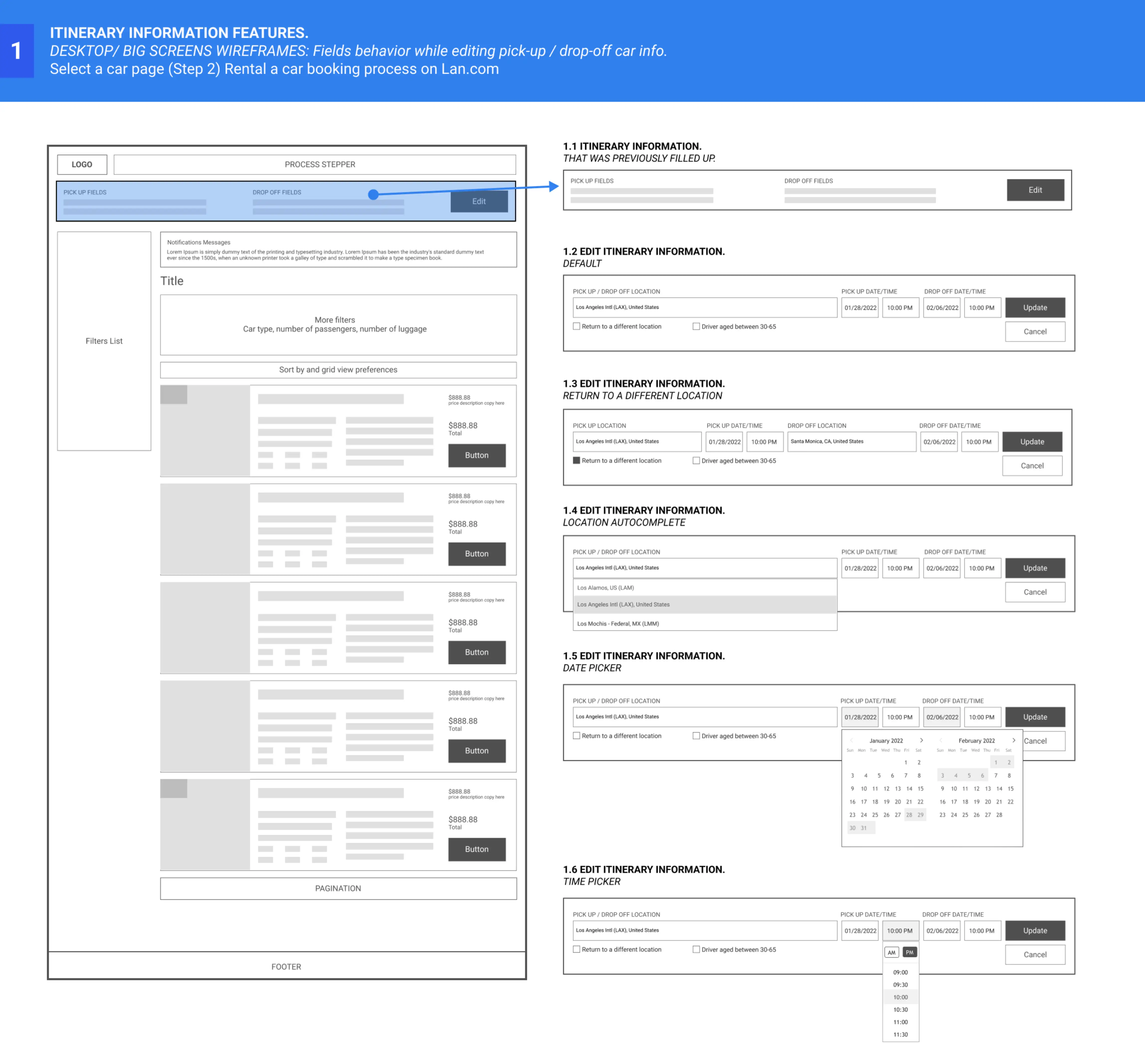
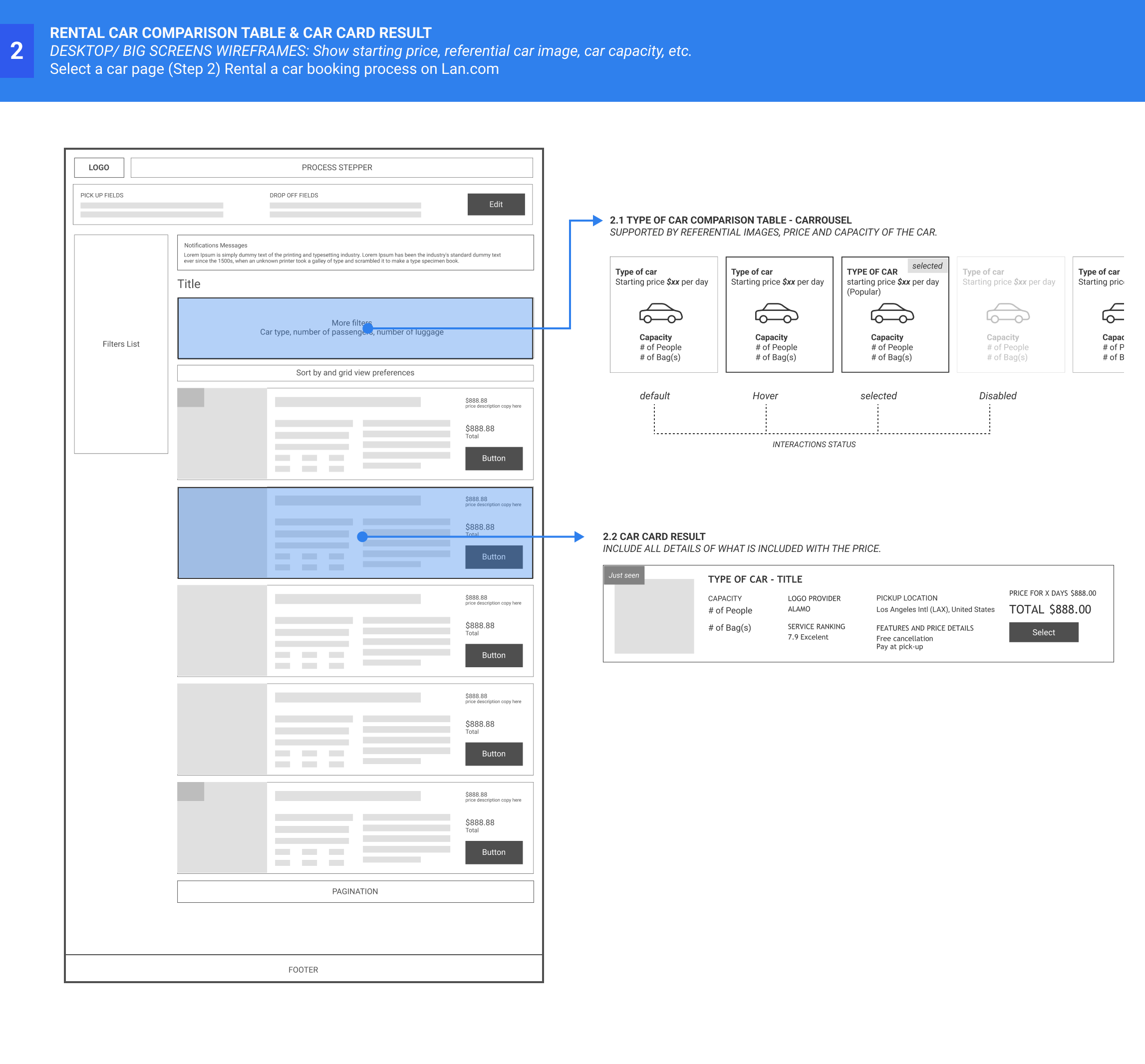
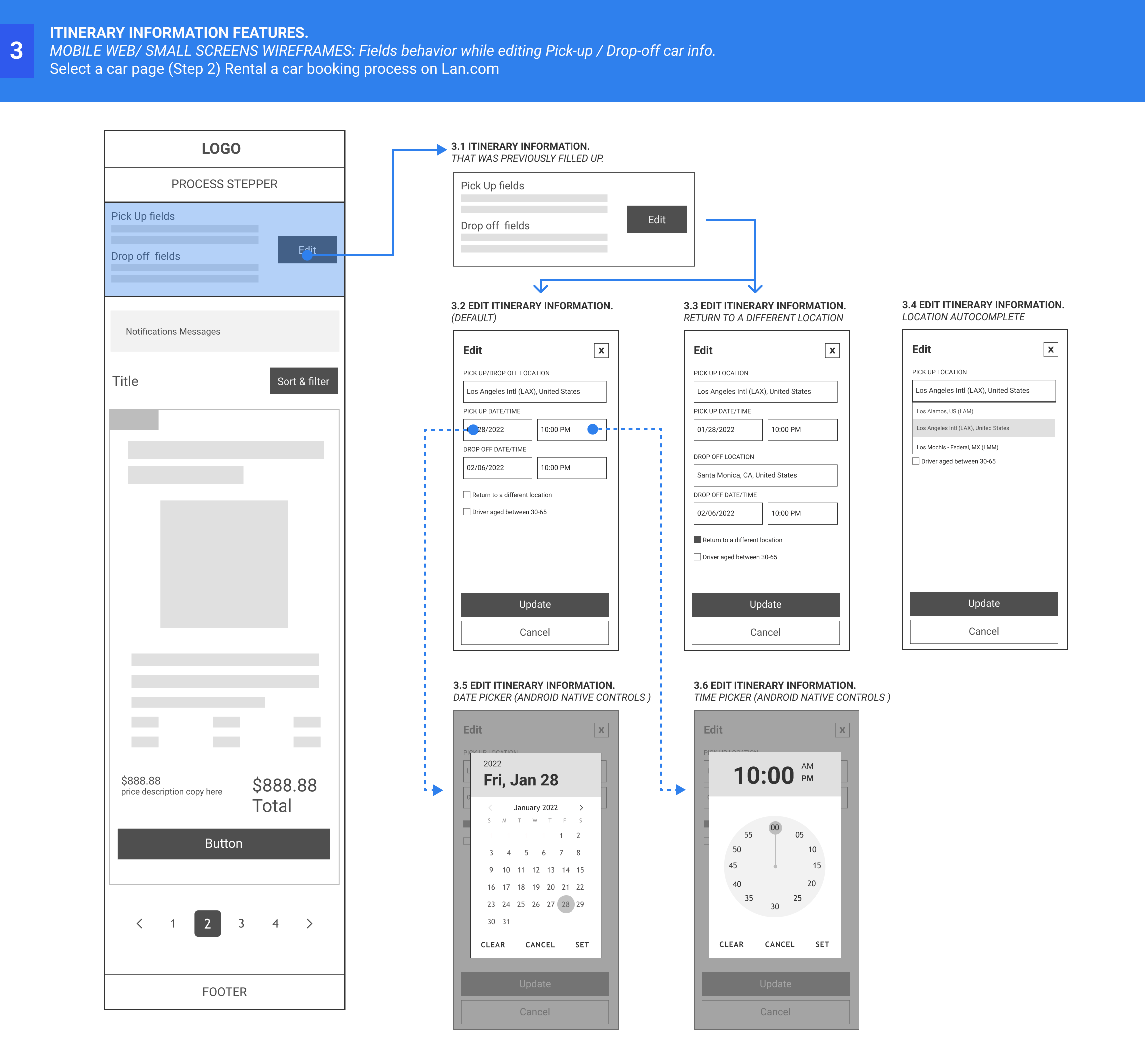
After this, I make low-fi wireframes to align stakeholders on the direction of my design. I chose low fidelity wireframe as the level of fidelity because the main idea was to communicate clearly the concepts in the workflow and get some feedback to iterate again.
Then, I worked on the mock-ups of the main features to work with the idea of running a hand-off with engineers to show the mock-ups and get more viable feedback.
Also, I did some prototypes to show the complexity of interactions with filters for the mobile web. These prototypes could show the value of this practice to the stakeholders, especially in the early stages, and support engineers in understanding the prototype's features.
The solution
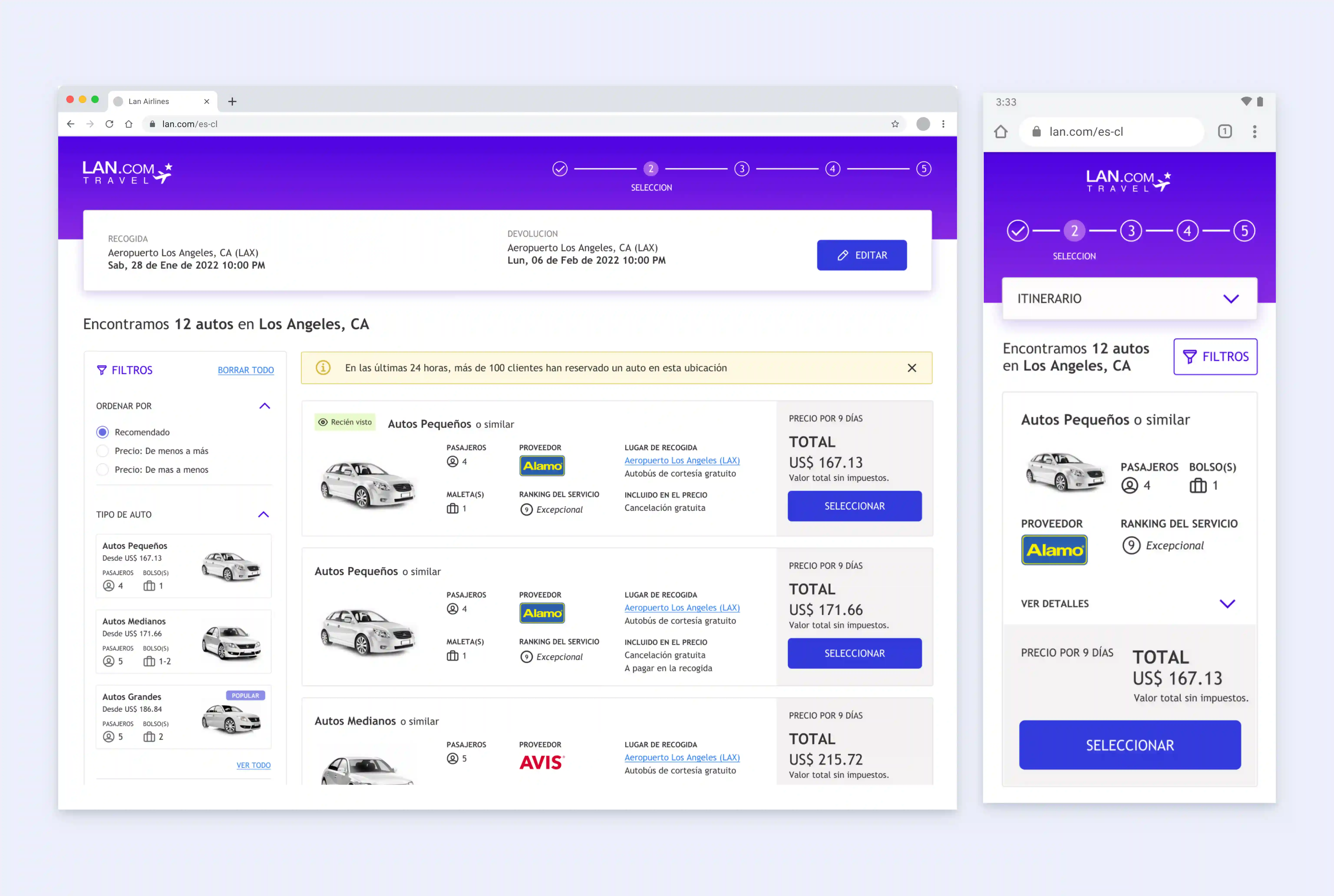
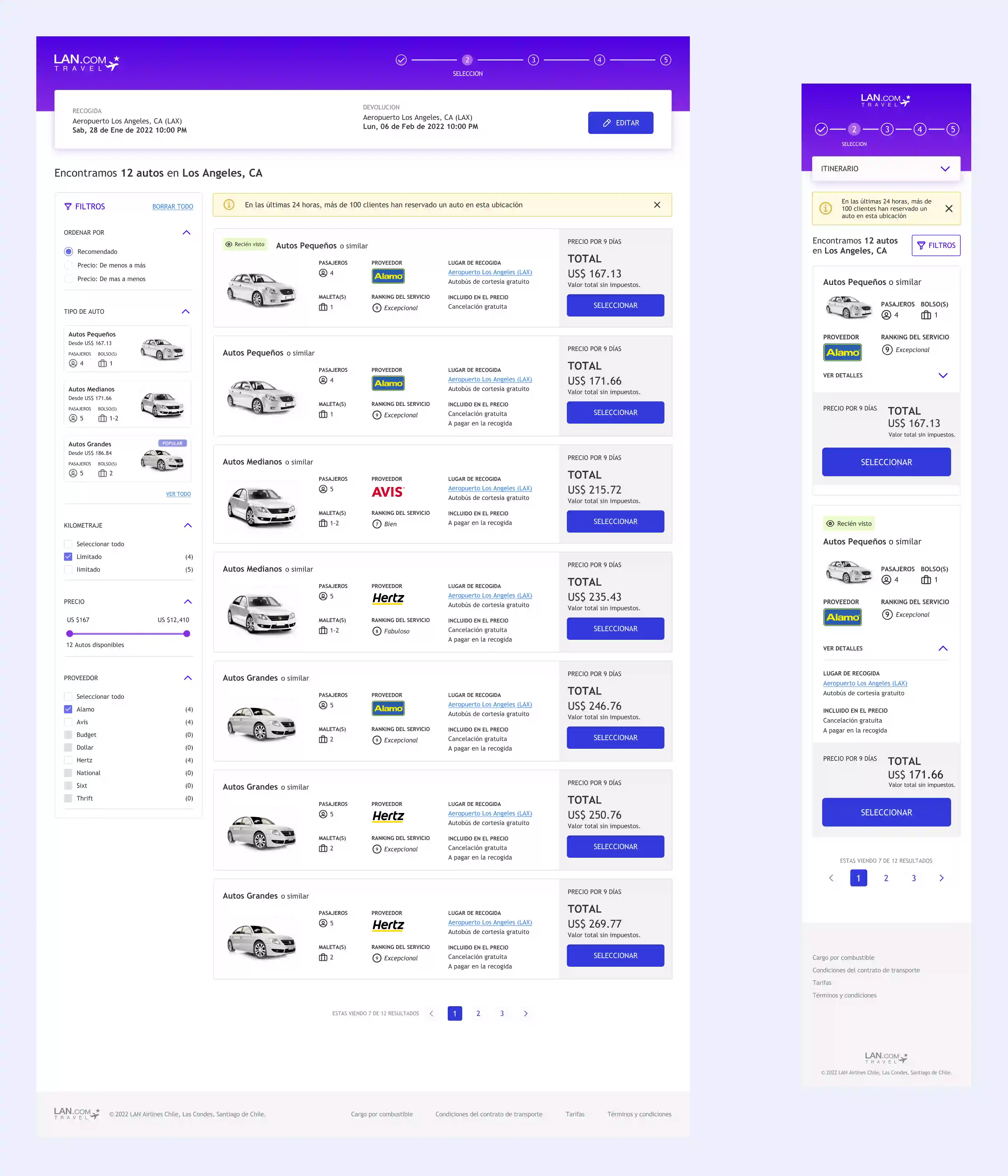
After writing about my process, this section will show the final proposal, which consists of a flat design as an approach to Lan’s brand style guides, and these are the list of features considered as a solution.
- Provide users with a mobile version of the booking rental car process to help to browse car options from any device.
- Responsive design is a primary approach of the mobile web.
- Improve filters for mobile by prioritizing users' filter preferences.
- Organize information and hierarchy content.
- Increase accessibility, more contrast, ensure that interactive elements are easy to identify, etc.
- Highlight product value, and use microcopy to create trust in users.
- Show users an editable itinerary section to change search summary details (web and mobile web)
- Give users control over when they want to edit or update their search results.
- Give them cues of what is happening while they change search results.
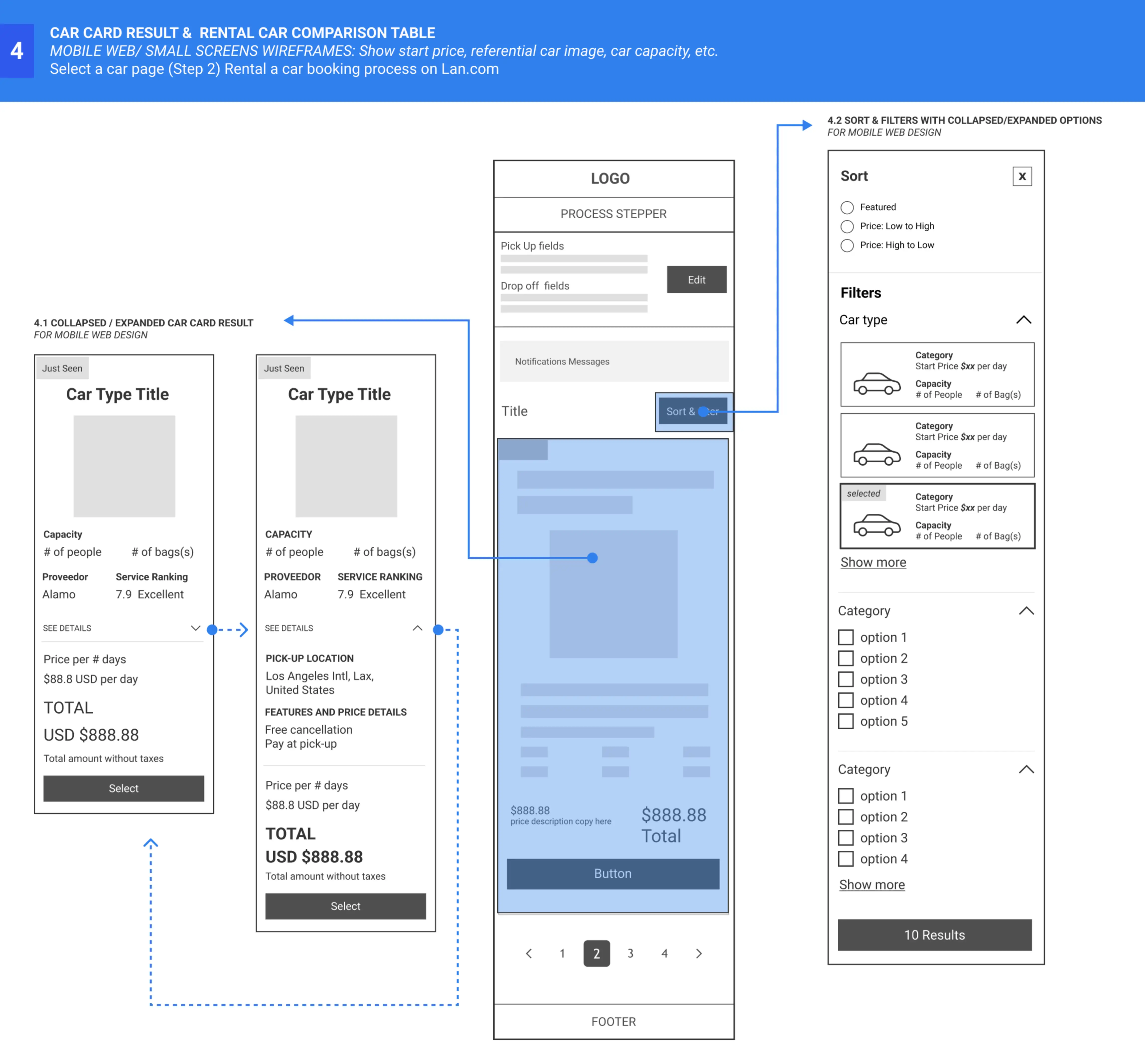
- Show users another way to compare a car by price, type, and capacity.
- Help users to decide by including referential car images so they can understand the type of car options vs. price and capacity.
- Consider the "price from" option instead to overwhelm users with information.
- Highlight the selected choices, and define the interactive status for each case.
- Provide users with more descriptive result items.
- Use microcopy to increase trust in users by adding what does price includes.
- Minimize the user's choosing time by adding a label when a result item is previously visited.
Desktop Prototypes
Mobile Prototypes
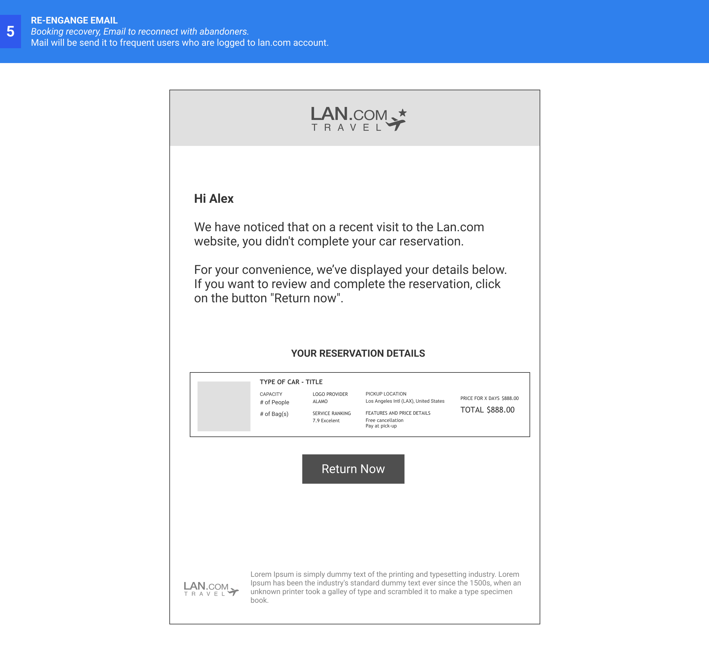
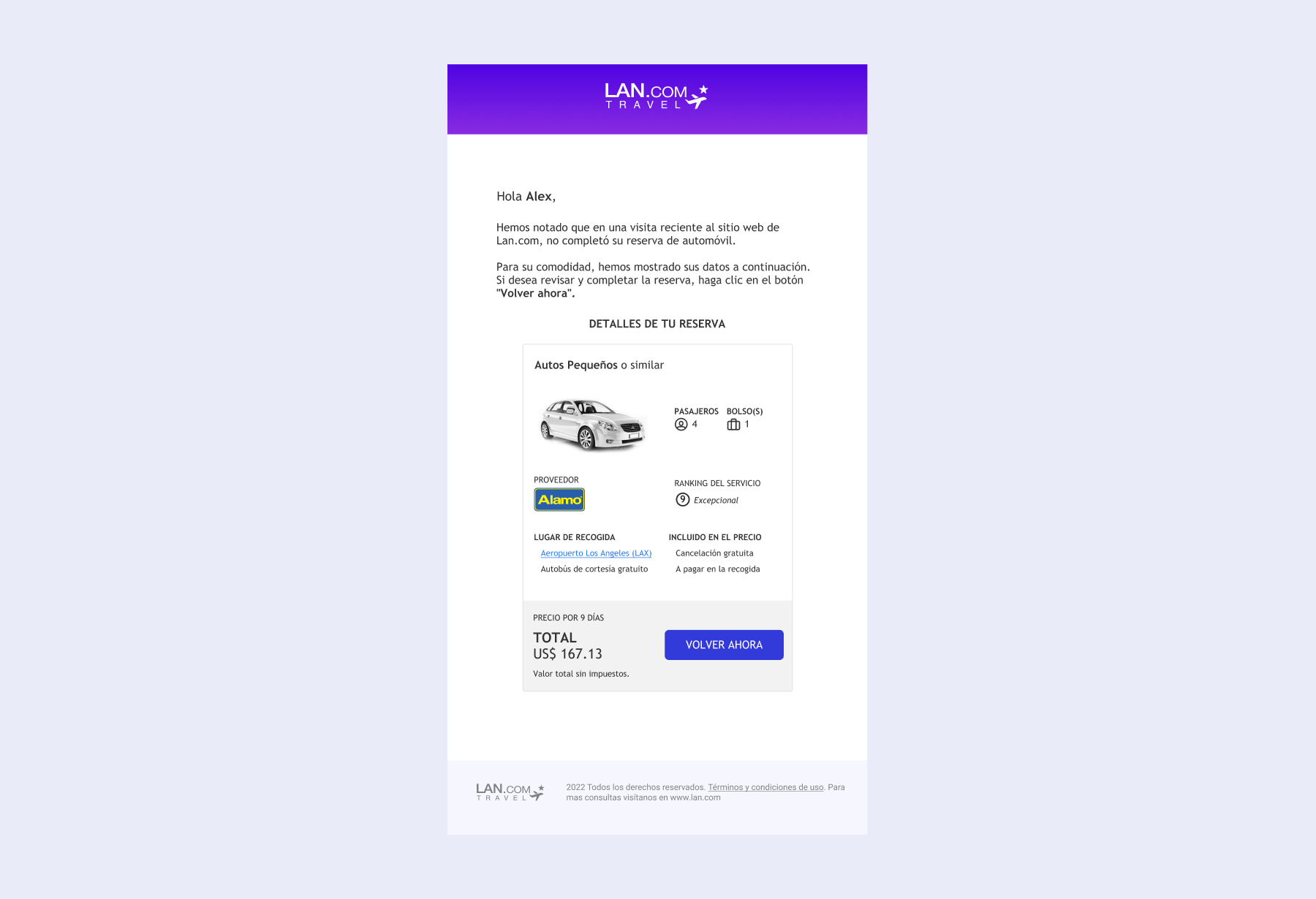
Provide users with a way to re-engage after leaving the selection page.
The Outcome
Many things have changed since I departed from Lan Airlines, starting with the name, now LATAM; The current rental platform also has changed, even though, as a former employee had the chance to work on this project was a great addition to my experience as a designer.
- About myself
- Because NDAs will make it very hard to show our work, I learned that by keeping notes from every project you worked on in the past. It will be a great practice to track my designer trajectory even if I cannot have the design screens of the product I worked on. However, I figured out a way to handle this case study.
- Another learning is understanding the travel business, OTAs, and how it is to as a designer in an airline company.
- My process
- I learned that a collaborative process, so it is essential to ask questions to all. Find allies, and show my designs as often and early as possible to get feedback from the beginning/during a project.
- Always consider A11Y as a base in every design.
- Regarding testing, this was the most significant debt in this project. For cost reasons, I couldn't test on a grand scale in testing platforms or actual users. I assume part of my design does o not perform as wanted, but ideally, I would love to introduce testing at the beginning, between, and at the end of the process. Including testing could help to save time and money in developing and creating more empathy for everyone involved in the process. And the best part is that it could help me defend my design decisions.
- My skills
- I got more experience working in asynchronous mode and communicating with colleagues who worked remotely. So it was a great opportunity as a designer to practice ways to show/explain my designs.
- Learn about management frameworks, such as kanban, to keep the project on track with the developer team.
- Communication skills, it was my first project in English. I took English classes after work to complement my learning in a second language.
